Return Notify & Review Optimization
Optimizing the return notify and review process for CaaStle’s subscription and rental platforms, ultimately enhancing user experience and brand alignment across web and iOS.
Client
CaaStle
Year
2025
PROJECT OVERVIEW
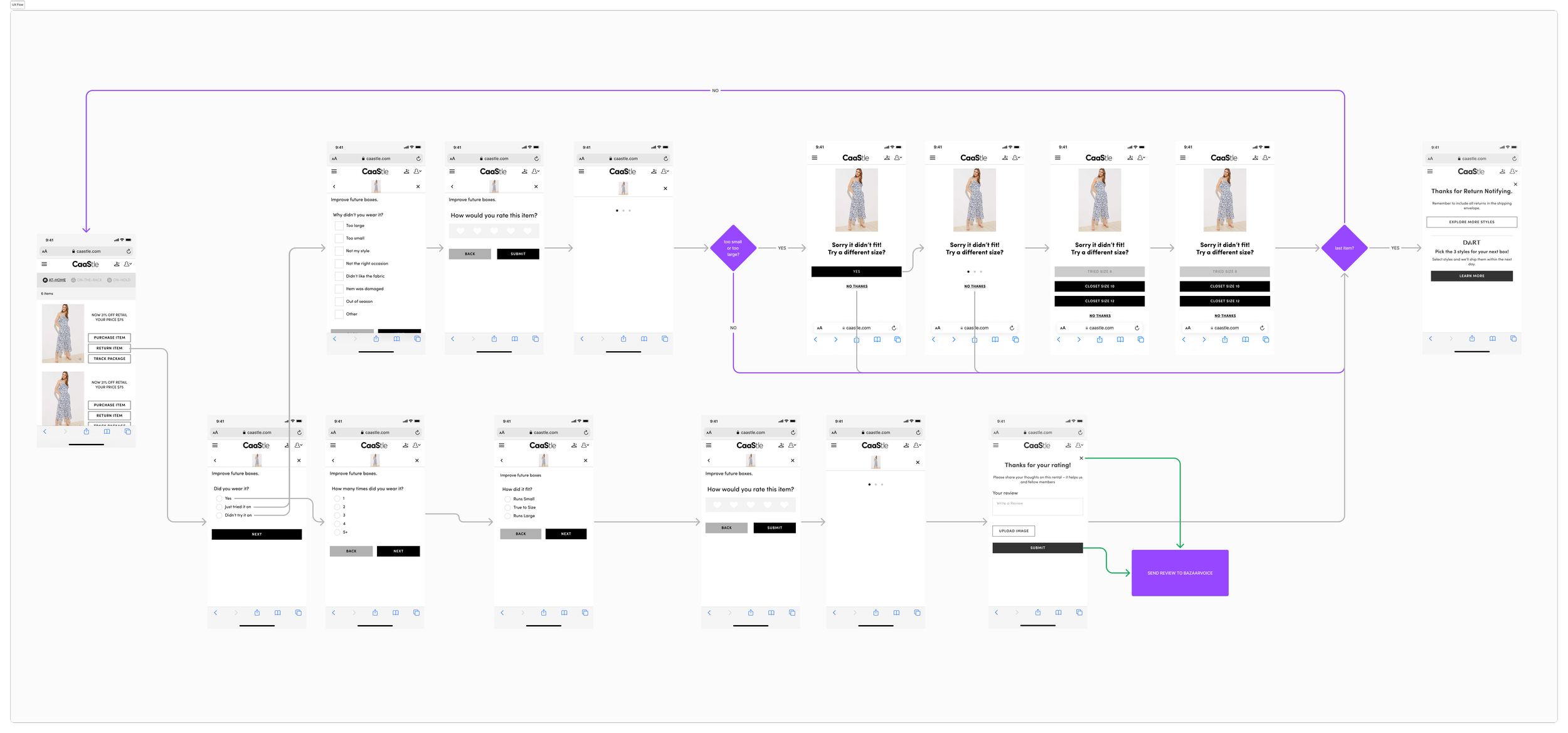
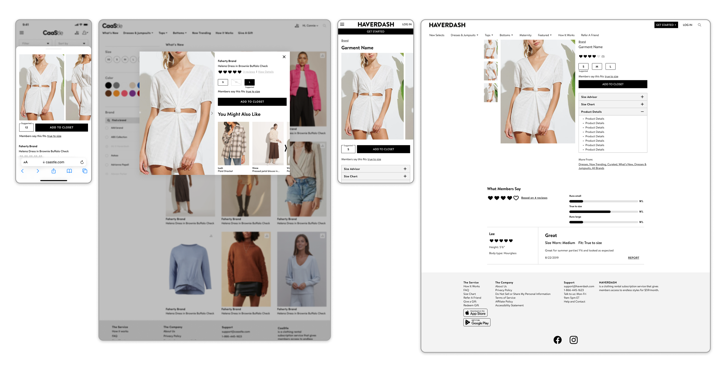
In this project, I focused on elevating the return notify and review process for members on CaaStle's platform, specifically for both web and iOS app implementations. The goal was to incorporate the SurveyMonkey return and review process seamlessly while ensuring adherence to brand standards. By refining the user experience, we aimed to make the review process more intuitive, aesthetically aligned with the brand, and ultimately more engaging for users.
the design process
-
I began by conducting a thorough review of the existing return and review process. This involved analyzing user feedback, including pain points reported through customer surveys and direct complaints. I identified key areas where users struggled—such as confusing navigation and a lack of visual clarity. This analysis laid the foundation for the design improvements, providing valuable insights into the most critical areas for change and guiding the direction of the project.
-
Next, I conducted additional UX research, including a competitive analysis of similar platforms in the industry. This allowed me to benchmark CaaStle’s return and review flows against best practices. I studied how competitors approached this process, focusing on elements like simplicity, user-friendly design, and clear calls to action. I also looked into industry trends to ensure that our solution not only addressed user pain points but also aligned with modern UX standards, ensuring our platform stayed relevant and effective in driving user interaction.
-
With the insights from research, I worked closely with the product manager to develop initial mockups and user flows. We iterated on these designs multiple times, testing different approaches to streamline the user journey. Key to this iteration was simplifying the process—removing unnecessary steps and ensuring that each page had a clear, direct purpose. We explored different visual styles, UI patterns, and interaction designs, always ensuring the experience felt intuitive and engaging for users.
-
To further enhance the return and review process, we decided to incorporate fit scores and fit summaries. This addition aimed to help users better assess the accuracy of their purchases and returns by providing personalized feedback based on their reviews and past interactions. By displaying these insights in a digestible format, users could make more informed decisions, ultimately improving the purchase and return flow. This change not only optimized the process but also made the review experience more valuable for users by addressing their primary concerns about fit and satisfaction.
-
Once the design was finalized, I collaborated closely with the engineering team to ensure a seamless implementation. This included detailed discussions around feasibility, technical constraints, and ensuring that the designs could be accurately executed within the development timeline. I participated in regular design reviews and was actively involved in troubleshooting any challenges that arose during the implementation process. This close collaboration ensured that the final product was not only visually appealing but also functional, stable, and aligned with user needs.
-
The final stage involved optimizing the process for both CaaStle’s subscription and rental platforms, ensuring that the experience was consistent and intuitive across both web and iOS. We paid particular attention to maintaining the brand’s aesthetic while adhering to platform-specific guidelines, ensuring that the experience felt native to each environment. This step was crucial in delivering a seamless experience for users, regardless of the platform they were using, and ensuring the changes contributed positively to both platforms' overall user satisfaction.
THE RESULT/impact
The redesigned return and review process resulted in a more intuitive and visually aligned experience that adhered to CaaStle’s brand guidelines. By simplifying the flow and integrating fit scores and summaries, users were able to make quicker, more confident decisions. As a result, we saw a marked increase in user engagement, with a significant rise in the number of reviews submitted compared to the previous system. The improvements to the process made it easier for users to navigate, leading to higher user satisfaction and a more seamless experience across both subscription and rental platforms.